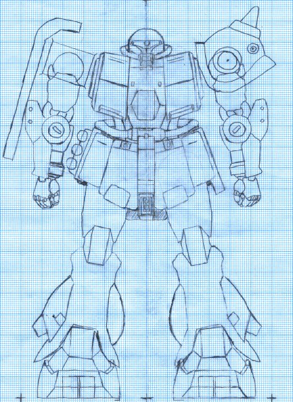
Ortho front/back/side #2
By tetsujin on 2006-06-06 in Models
Tags: 1:100 Zaku Kai, Plans
This front view is mostly a combination of Ortho Front #1 and Leg v5 redrawn on a light table. This front-view also incorporates various improvements and additions that were made on the computer composites, like the second arm, the shield, etc. I created it in order to have a solid baseline for creating side and rear views of the Zaku.The back view started as a trace of the front view in reverse – but the details for the rear of the leg were traced in, and I took a crack at defining the measurements for the rear skirts and backpack.
More recently, I’ve added a side view which is now included on this page. All three views will likely be revised as I find things which need refinement.


Summary
One of the constant challenges in this project is that what looks good from one angle doesn’t necessarily look good from another. I think the inclusion of the rear view went pretty smoothly all things considered. It always takes some experimentation to find the best way to arrange a part of the design that hasn’t been boiled down into measurements yet. Having the rear view in as good shape as it is makes me feel good about the state of this project, and I feel I can look forward to the point when all these plans will be done, and I’ll get started building. I think the V5 leg realy shines in these plans. All my previous hand-drawn full views have had poorly-traced renderings of inferior (and now obsolete) versions of my leg design… the rough, crooked lines of those legs really detracted from the whole, just as all the little sloppy bits of the drawing did. The new renderings have their rough ares, to be sure, but I feel it’s a big improvement in terms of clarity.
Somewhere in between the original ortho #1 and this rendering, the contour of the chest block changed: the top corners moved inward by 1mm. I’m not sure if this was intentional or if it was an error introduced somewhere along the way. As far as I can tell the change originated in my first three-view rendering of the chest block. I’m not entirely sure if the change should stay, but right now I’m inclined to keep it, as it makes the body look more dynamic. The original placement of that top corner made the chest look more rectangular, and possibly a bit too rigid.
It’s possible that this design change was an effort to prevent the bulk of the chest from overwhelming the head: there has been some discussion about whether the head might have been too small in my original rendering. My feeling has always been that the head was just as it should be and that perhaps adjusting the surrounding areas to improve the balance might be the way to go. So I think I may have been attempting that in this rendering. Based on the drawings I think the chest might be too sleek – but based on the physical prototype I made from this plan, I think it’s actually about right.
Post a Comment